@font-face {
font-family: 'Satoshi-Light';
src: url('fonts/Satoshi-Light.woff2') format('woff2'),
url('fonts/Satoshi-Light.woff') format('woff'),
url('fonts/Satoshi-Light.ttf') format('truetype');
font-weight: 300; font-display: swap; font-style: normal;
}
@font-face {
font-family: 'Satoshi-Regular';
src: url('fonts/Satoshi-Regular.woff2') format('woff2'),
url('fonts/Satoshi-Regular.woff') format('woff'),
url('fonts/Satoshi-Regular.ttf') format('truetype');
font-weight: 400; font-display: swap; font-style: normal;
}
@font-face {
font-family: 'Satoshi-Medium';
src: url('fonts/Satoshi-Medium.woff2') format('woff2'),
url('fonts/Satoshi-Medium.woff') format('woff'),
url('fonts/Satoshi-Medium.ttf') format('truetype');
font-weight: 500; font-display: swap; font-style: normal;
}
@font-face {
font-family: 'Satoshi-Bold';
src: url('fonts/Satoshi-Bold.woff2') format('woff2'),
url('fonts/Satoshi-Bold.woff') format('woff'),
url('fonts/Satoshi-Bold.ttf') format('truetype');
font-weight: 700; font-display: swap; font-style: normal;
}
@font-face {
font-family: 'Boska-Regular';
src: url('fonts/Boska-Regular.woff2') format('woff2'),
url('fonts/Boska-Regular.woff') format('woff'),
url('fonts/Boska-Regular.ttf') format('truetype');
font-weight: 400; font-display: swap; font-style: normal;
}
@font-face {
font-family: 'Boska-Italic';
src: url('fonts/Boska-Italic.woff2') format('woff2'),
url('fonts/Boska-Italic.woff') format('woff'),
url('fonts/Boska-Italic.ttf') format('truetype');
font-weight: 400; font-display: swap; font-style: italic;
}
@font-face {
font-family: 'Boska-Bold';
src: url('fonts/Boska-Bold.woff2') format('woff2'),
url('fonts/Boska-Bold.woff') format('woff'),
url('fonts/Boska-Bold.ttf') format('truetype');
font-weight: 700; font-display: swap; font-style: normal;
}
body {
background-color: #10100f !important;
color: #efede8 !important;
font-family: 'Satoshi-Regular', sans-serif;
overflow-x: hidden;
}
.font-serif-heading { font-family: 'Boska-Bold', Georgia, serif; }
.font-serif-quote { font-family: 'Boska-Italic', Georgia, serif; }
::-webkit-scrollbar { width: 8px; }
::-webkit-scrollbar-track { background: #10100f; }
::-webkit-scrollbar-thumb { background: #3a3a37; border-radius: 4px; }
::-webkit-scrollbar-thumb:hover { background: #555550; }
.art-frame { box-shadow: 0 20px 50px -10px rgba(0, 0, 0, 0.8), 0 0 1px 1px rgba(255, 255, 255, 0.1); }
.placeholder-tag { font-family: 'Satoshi-Bold', sans-serif; letter-spacing: 0.05em; }
.gallery-item { cursor: zoom-in; }
*, *::before, *::after { box-sizing: border-box; }
.min-h-screen { min-height: 100vh; }
.flex { display: flex; }
.flex-col { flex-direction: column; }
.flex-grow { flex-grow: 1; }
.shrink-0 { flex-shrink: 0; }
.inline-flex { display: inline-flex; }
.hidden { display: none !important; }
.block { display: block; }
.inline-block { display: inline-block; }
.grid { display: grid; }
.items-center { align-items: center; }
.items-start { align-items: flex-start; }
.justify-center { justify-content: center; }
.justify-between { justify-content: space-between; }
.relative { position: relative; }
.absolute { position: absolute; }
.fixed { position: fixed; }
.sticky { position: sticky; }
.top-0 { top: 0; }
.inset-0 { top: 0; right: 0; bottom: 0; left: 0; }
.z-40 { z-index: 40; }
.z-50 { z-index: 50; }
.h-20 { height: 5rem; }
.h-10 { height: 2.5rem; }
.w-10 { width: 2.5rem; }
.h-8 { height: 2rem; }
.w-8 { width: 2rem; }
.h-7 { height: 1.75rem; }
.w-7 { width: 1.75rem; }
.h-6 { height: 1.5rem; }
.w-6 { width: 1.5rem; }
.h-5 { height: 1.25rem; }
.w-5 { width: 1.25rem; }
.h-3\.5 { height: 0.875rem; }
.w-3\.5 { width: 0.875rem; }
.w-16 { width: 4rem; }
.h-0\.5 { height: 0.125rem; }
.w-full { width: 100%; }
.h-full { height: 100%; }
.max-w-7xl { max-width: 80rem; }
.max-w-5xl { max-width: 64rem; }
.max-w-3xl { max-width: 48rem; }
.max-w-2xl { max-width: 42rem; }
.max-w-xl { max-width: 36rem; }
.max-h-\[80vh\] { max-height: 80vh; }
.mx-auto { margin-left: auto; margin-right: auto; }
.p-2 { padding: 0.5rem; }
.p-3 { padding: 0.75rem; }
.p-4 { padding: 1rem; }
.p-6 { padding: 1.5rem; }
.p-8 { padding: 2rem; }
.px-4 { padding-left: 1rem; padding-right: 1rem; }
.px-6 { padding-left: 1.5rem; padding-right: 1.5rem; }
.px-8 { padding-left: 2rem; padding-right: 2rem; }
.py-2 { padding-top: 0.5rem; padding-bottom: 0.5rem; }
.py-4 { padding-top: 1rem; padding-bottom: 1rem; }
.py-8 { padding-top: 2rem; padding-bottom: 2rem; }
.py-12 { padding-top: 3rem; padding-bottom: 3rem; }
.py-16 { padding-top: 4rem; padding-bottom: 4rem; }
.py-20 { padding-top: 5rem; padding-bottom: 5rem; }
.mb-2 { margin-bottom: 0.5rem; }
.mb-4 { margin-bottom: 1rem; }
.mb-6 { margin-bottom: 1.5rem; }
.mb-8 { margin-bottom: 2rem; }
.mb-10 { margin-bottom: 2.5rem; }
.mb-12 { margin-bottom: 3rem; }
.mt-0\.5 { margin-top: 0.125rem; }
.mt-1 { margin-top: 0.25rem; }
.mt-2 { margin-top: 0.5rem; }
.mt-4 { margin-top: 1rem; }
.my-4 { margin-top: 1rem; margin-bottom: 1rem; }
.gap-1\.5 { gap: 0.375rem; }
.gap-2 { gap: 0.5rem; }
.gap-3 { gap: 0.75rem; }
.gap-4 { gap: 1rem; }
.gap-6 { gap: 1.5rem; }
.gap-8 { gap: 2rem; }
.gap-12 { gap: 3rem; }
.space-y-3 > * + * { margin-top: 0.75rem; }
.space-y-4 > * + * { margin-top: 1rem; }
.space-y-6 > * + * { margin-top: 1.5rem; }
.space-x-6 > * + * { margin-left: 1.5rem; }
.bg-slate-950 { background-color: #10100f; }
.bg-slate-950\/90 { background-color: rgba(16, 16, 15, 0.9); }
.bg-slate-900 { background-color: #161615; }
.bg-slate-900\/80 { background-color: rgba(22, 22, 21, 0.8); }
.bg-slate-900\/50 { background-color: rgba(22, 22, 21, 0.5); }
.bg-amber-500\/10 { background-color: rgba(245, 158, 11, 0.1); }
.bg-amber-500 { background-color: #f59e0b; }
.bg-black\/95 { background-color: rgba(0, 0, 0, 0.95); }
.text-slate-100 { color: #efede8; }
.text-slate-200 { color: #efede8; }
.text-slate-300 { color: #bbb6af; }
.text-slate-400 { color: #88847e; }
.text-slate-500 { color: #88847e; }
.text-slate-950 { color: #10100f; }
.text-amber-400 { color: #fbbf24; }
.text-amber-400\/90 { color: rgba(251, 191, 36, 0.9); }
.text-amber-300 { color: #fcd34d; }
.text-amber-100\/90 { color: rgba(254, 243, 199, 0.9); }
.border { border-width: 1px; border-style: solid; }
.border-b { border-bottom-width: 1px; border-bottom-style: solid; }
.border-t { border-top-width: 1px; border-top-style: solid; }
.border-y { border-top-width: 1px; border-bottom-width: 1px; border-style: solid; }
.border-slate-800 { border-color: #2f2f2d; }
.border-slate-800\/80 { border-color: rgba(47, 47, 45, 0.8); }
.border-slate-700 { border-color: #3a3a37; }
.border-slate-900 { border-color: #161615; }
.border-amber-500\/40 { border-color: rgba(245, 158, 11, 0.4); }
.border-amber-500\/20 { border-color: rgba(245, 158, 11, 0.2); }
.rounded-sm { border-radius: 0.125rem; }
.rounded { border-radius: 0.25rem; }
.rounded-md { border-radius: 0.375rem; }
.rounded-lg { border-radius: 0.5rem; }
.rounded-full { border-radius: 9999px; }
.text-\[10px\] { font-size: 10px; }
.text-xs { font-size: 0.75rem; line-height: 1rem; }
.text-sm { font-size: 0.875rem; line-height: 1.25rem; }
.text-base { font-size: 1rem; line-height: 1.5rem; }
.text-lg { font-size: 1.125rem; line-height: 1.75rem; }
.text-xl { font-size: 1.25rem; line-height: 1.75rem; }
.text-3xl { font-size: 1.875rem; line-height: 2.25rem; }
.text-4xl { font-size: 2.25rem; line-height: 2.5rem; }
.font-normal { font-weight: 400; }
.font-medium { font-weight: 500; }
.font-semibold { font-weight: 600; }
.font-bold { font-weight: 700; }
.uppercase { text-transform: uppercase; }
.not-italic { font-style: normal; }
.tracking-tighter { letter-spacing: -0.05em; }
.tracking-tight { letter-spacing: -0.025em; }
.tracking-wide { letter-spacing: 0.025em; }
.tracking-wider { letter-spacing: 0.05em; }
.tracking-widest { letter-spacing: 0.1em; }
.leading-relaxed { line-height: 1.625; }
.text-center { text-align: center; }
.aspect-\[4\/5\] { aspect-ratio: 4 / 5; }
.object-cover { object-fit: cover; }
.object-contain { object-fit: contain; }
.overflow-hidden { overflow: hidden; }
.backdrop-blur-md { backdrop-filter: blur(12px); }
.transition { transition: all 150ms cubic-bezier(0.4, 0, 0.2, 1); }
.transition-all { transition: all 150ms cubic-bezier(0.4, 0, 0.2, 1); }
.transition-colors { transition: color 150ms, background-color 150ms, border-color 150ms; }
.transition-transform { transition: transform 150ms; }
.duration-200 { transition-duration: 200ms; }
.duration-300 { transition-duration: 300ms; }
.duration-500 { transition-duration: 500ms; }
.shadow-2xl { box-shadow: 0 25px 50px -12px rgba(0, 0, 0, 0.25); }
.shadow-xl { box-shadow: 0 20px 25px -5px rgba(0, 0, 0, 0.1); }
.shadow-amber-500\/20 { box-shadow: 0 20px 25px -5px rgba(245, 158, 11, 0.2); }
.hover\:opacity-90:hover { opacity: 0.9; }
.hover\:text-white:hover { color: #ffffff; }
.hover\:text-amber-400:hover { color: #fbbf24; }
.hover\:bg-amber-400:hover { background-color: #fbbf24; }
.hover\:bg-amber-500\/10:hover { background-color: rgba(245, 158, 11, 0.1); }
.hover\:border-amber-400:hover { border-color: #fbbf24; }
.group:hover .group-hover\:border-amber-500\/60 { border-color: rgba(245, 158, 11, 0.6); }
.group:hover .group-hover\:scale-105 { transform: scale(1.05); }
@media (min-width: 640px) {
.sm\:grid-cols-2 { grid-template-columns: repeat(2, minmax(0, 1fr)); }
.sm\:flex-row { flex-direction: row; }
.sm\:px-6 { padding-left: 1.5rem; padding-right: 1.5rem; }
.sm\:p-8 { padding: 2rem; }
.sm\:pb-0 { padding-bottom: 0; }
.sm\:border-b-0 { border-bottom-width: 0; }
.sm\:col-span-2 { grid-column: span 2 / span 2; }
.sm\:text-base { font-size: 1rem; line-height: 1.5rem; }
.sm\:text-xl { font-size: 1.25rem; line-height: 1.75rem; }
.sm\:text-2xl { font-size: 1.5rem; line-height: 2rem; }
.sm\:text-4xl { font-size: 2.25rem; line-height: 2.5rem; }
.sm\:text-5xl { font-size: 3rem; line-height: 1; }
.sm\:-left-4 { left: -1rem; }
.sm\:-right-4 { right: -1rem; }
}
@media (min-width: 768px) {
.md\:flex { display: flex !important; gap: 2rem; align-items: center; }
.md\:hidden { display: none !important; }
.md\:grid-cols-2 { grid-template-columns: repeat(2, minmax(0, 1fr)); }
.md\:flex-row { flex-direction: row; }
.md\:items-end { align-items: flex-end; }
.md\:py-20 { padding-top: 5rem; padding-bottom: 5rem; }
}
@media (min-width: 1024px) {
.lg\:grid-cols-3 { grid-template-columns: repeat(3, minmax(0, 1fr)); }
.lg\:col-span-1 { grid-column: span 1 / span 1; }
.lg\:col-span-2 { grid-column: span 2 / span 2; }
.lg\:px-8 { padding-left: 2rem; padding-right: 2rem; }
.lg\:text-6xl { font-size: 3.75rem; line-height: 1; }
.lg\:gap-12 { gap: 3rem; }
}
/* Light Mode Anpassungen (ebenfalls neutralisiert) */
html.light,
html.light body {
background-color: #f2f0eb !important;
color: #121212 !important;
}
html.light header {
background-color: rgba(242, 240, 235, 0.95) !important;
border-color: #d4cec6 !important;
}
html.light .bg-slate-950,
html.light .bg-slate-950\/90,
html.light .bg-slate-900,
html.light .bg-slate-900\/90,
html.light section {
background-color: #f7f5f1 !important;
}
html.light section#konzept,
html.light section#kontakt {
background-color: #e8e3dc !important;
border-color: #d4cec6 !important;
}
html.light .art-frame,
html.light .gallery-item,
html.light .bg-slate-900\/50,
html.light .bg-slate-900\/80,
html.light figcaption {
background-color: #ffffff !important;
border-color: #d4cec6 !important;
box-shadow: 0 4px 16px rgba(0,0,0,0.06) !important;
}
html.light .border-slate-800,
html.light .border-slate-800\/80,
html.light .border-slate-700,
html.light .border-slate-900 {
border-color: #d4cec6 !important;
}
html.light .text-slate-100,
html.light .text-slate-200,
html.light h1,
html.light h2,
html.light h3,
html.light h4 {
color: #121212 !important;
}
html.light .text-slate-300,
html.light .text-slate-400,
html.light blockquote p {
color: #333333 !important;
}
html.light .text-slate-500,
html.light figcaption .caption-sub {
color: #666666 !important;
}
html.light .text-amber-400,
html.light .text-amber-300,
html.light .text-amber-200,
html.light .text-amber-400\/90,
html.light .text-amber-100\/90,
html.light .eyebrow {
color: #121212 !important;
}
html.light .border-amber-500\/40,
html.light .border-amber-500\/20,
html.light .border-amber-400 {
border-color: #121212 !important;
}
html.light .bg-amber-500\/10 {
background-color: rgba(18, 18, 18, 0.06) !important;
}
html.light .bg-amber-500 {
background-color: #121212 !important;
color: #ffffff !important;
}
html.light .bg-amber-500:hover {
background-color: #2d2d2d !important;
}
html.light .w-16.h-0\.5 {
background-color: #121212 !important;
}
html.light #lightbox {
background-color: rgba(242, 240, 235, 0.97) !important;
}
html.light #lightbox * {
color: #121212 !important;
}
html.light #lightbox .text-amber-400 {
color: #fbbf24 !important;
}
/* NEU: Fix für die Buttons im Light Mode (Dunkle Symbole auf hellem Grund) */
html.light #lightbox .nav-btn,
html.light #lightbox .close-btn {
background: rgba(255, 255, 255, 0.85) !important;
border-color: #d4cec6 !important;
color: #121212 !important;
}
Projekt / Schwarz-Weiß Photographie · Schweden
Coast of Sweden
Küste und Weite in Schwarz-Weiß — ein einzelner Baum behauptet sich gegen die Elemente, wo Natur und skandinavischer Mythos aufeinandertreffen.
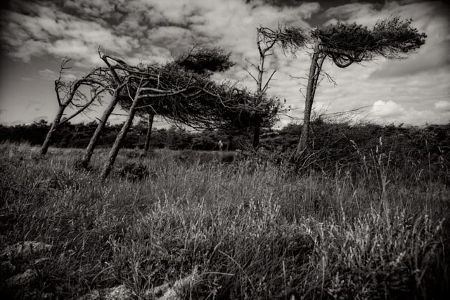
Der Windflüchter
Schwedische Küste · Geformt durch Wind und Elemente
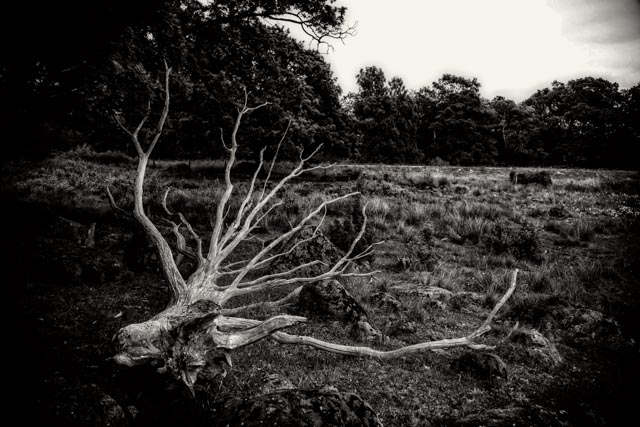
Skulpturales Totholz
Schwedische Küste · Verwitterte Formen im Dünensand
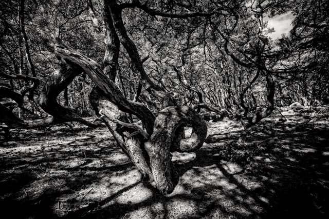
Knorriger Küstenwald
Schwedische Küste · Licht und Schatten im Gehöltz
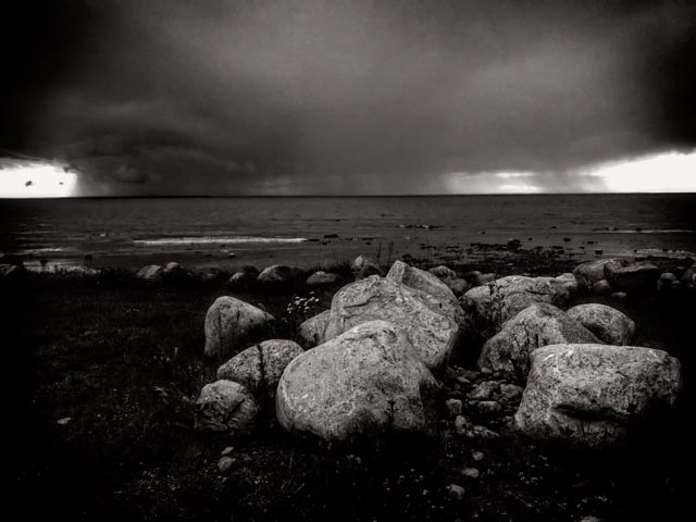
Schären & Findlinge
Schwedische Küste · Glattgeschliffener Stein im Wasser
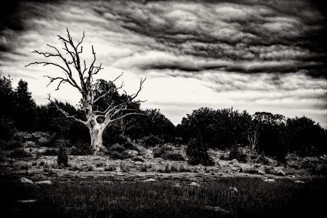
Solitär im Gegenlicht
Schwedische Küste · Silhouette gegen den Weiten Himmel
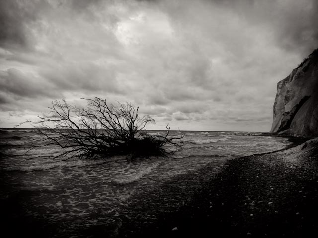
Birke am Wasser
Schwedische Küste · Filigranes Geäst an der Uferlinie
Die Magie der nordischen Landschaft
„Schwarz-Weiß-Fotografie erfordert die Gabe der Beobachtung – und die Fähigkeit, die Natur ins Mythische zu abstrahieren.“
— Sven Teuber, *Photographie & Digital Painting*
Form durch Wind und Zeit
Die schwedische Küstenlandschaft ist gezeichnet von extremen Witterungseinflüssen. Windgebeugte Kiefern, verwittertes Totholz und abgeschliffenes Gestein prägen das Landschaftsbild. Die Kamera fängt diese natürlichen Skulpturen ein und verdichtet sie zu grafischen Strukturen aus Licht und Schatten.
Durch die konsequente Schwarz-Weiß-Ästhetik löst sich die Darstellung von der rein dokumentarischen Landaufnahme und überführt die Motive in eine reduzierte, zeichnerische Bildsprache.
Mythos und Stille
Die weiten Küsten und Wälder Skandinaviens inspirierten seit jeher die nordische Mythologie und Folklore. Die Fotografien greifen diese geheimnisvolle Grundstimmung auf: Verdrehte Äste und fremdartige Felsformen wirken wie stille Protagonisten einer alten Erzählung.
Es entsteht ein visueller Denkraum, der Raum lässt für eigene Assoziationen, Erinnerungen und das Erleben unberührter Natur.
Spezifikationen
Werkdaten
Fein abgestimmte Schwarz-Weiß-Fotografien aus der Serie Coast of Sweden.
Fine Art Fotografie
Werkgruppe Schwarz-Weiß · Erstveröffentlichung: 25. Juni 2016.
Exponat-Status
Für Ausstellungen verfügbar (Auf Anfrage)
Anzahl der Werke
6 Fotografien (kuratierte Auswahl)
Größe / Abmessung
Format: Flexibel für Ausstellungsräume
Ausführung / Träger
Fine Art Print / Atelier-Fertigung
Entstehungsort
Küstenregion, Schweden
Ausstellungsanfrage
Falls Sie Interesse haben diese Serie auszustellen, kontaktieren Sie mich bitte.
Atelier Sven Teuber • E-Mail: art@sven-teuber.info
© 2026 Sven Teuber. Alle Rechte an den Fotografien vorbehalten.
Sven Teuber — Coast of Sweden
Tipp: Pfeiltasten [←] [→] zum Wechseln, [ESC] zum Schließen der Vollbildansicht.